A Historic Journey Atletico Madrid Shirt History
Atletico Madrid Shirt History
Ironically, Atletico Madrid was founded in April 1903 as the Madrid Athletic Club by three Basque students living in the city. The founders originally saw the new club as the youth branch of their childhood team Athletic Bilbao. What’s even more surprising is that they are called “Colchoneros”, which means mattress makers in English. This is because the mattresses in Spain had red and white covers which were of course the color of their home kit. Anyway, enough trivia, let’s find out more about the history of the kit maker and shirt sponsors.
History of the Atletico Madrid kit manufacturer
2001 – present – Nike
Nike has been Atletico’s main partner for 22 years, and with the deal running until 2026, it could reach 25 years. To highlight the pair’s tenure together, Atletico Madrid was playing in Spain’s second division when the deal was originally signed.
Coincidentally, the 11-time La Liga champions returned to La Liga for their first season wearing Nike stripes. Atlético won the Second Division in the 2001/02 season with a basic V-neck polo shirt with red and white stripes at the base, with small touches of blue. The arms were mainly white but had red spots underneath as well as red arm cuffs. During their travels for this campaign, the Spanish club will wear either a red V-neck strip with horizontal stripes and black accents or a plain yellow V-neck polo shirt with a blue-collar.
In the return season to the First Division (2002/2003), the aforementioned red jersey was retained as the third jersey, but the home and away jerseys were redesigned. The base of the house was striped red and white, but the sides were three-quarters white and one-quarter red. The arms are mostly red, and there is also a red patch on the shoulders that separates the front from the back. The away shirt was a dark blue crew neck with gold side panels, sleeve cuffs, and a neckline.
As the club was founded in 1903, Atletico celebrated in the 2002/03 campaign with a beautiful centenary shirt. It was a central badge designed in the shape of a V, in the club’s traditional colors. Below the crest is an inscribed gold scroll 1903-2003. The Nike badge was also gold and was placed directly below the club crest.
From 2003 to 2005, the club’s sponsorship deal with film company Columbia Pictures saw the appearance of some strange Atletico shirts. The agreement means that their sets will be used for advertisements when new films are released. The oddest feature that springs to mind is the webbed Spider-Man away kit which they wore in 2004/05. However, amidst all this drama (no pun intended), the Spanish club was also part of Nike’s anti-racism initiative that brought together a half-black, half-white team in the same season.
The 2013/14 squad entered the club’s history books, the year in which Diego Simeone led the Spanish giants to their first La Liga title since 1995/96, breaking the dominance of Barcelona and Real Madrid. Atletico came from behind to win a 1-1 draw at Camp Nou on a historic final day wearing a yellow and blue shirt. The previous season was equally important, as the club won the Copa del Rey for the first time since the 1995-96 double. In the 2012/13 season, Atlético wore a black and gray horizontal striped kit with red dots around the sleeves and the stripe of the shirt. The inside of the shirt had the phrase “One Feeling, One Passion, One Pride” printed on it.
The next La Liga title came in an equally dramatic fashion in 2020/21, as Luis Suárez scored the winner in a 2-1 victory over Madrid New Yasinga Achibaki Bonmay Kesinga Real Madrid Abuban Rebar Aha Kilke Ahme Goa Weather Egypt. Along with the classic navy blue polo collar, Nike has added red and white stripes to the home shirt this season. The away shirt was navy blue with red detailing, including hoops around the collar. Quite fittingly, a trident has been printed on the inner neck to pay homage to the Neptune Fountain where Atletico traditionally celebrate their title win. The third shirt was the most eye-catching, being a light lime color with a white pattern on the base. It also has black side panels.
Atletico moved to their new stadium, the Civitas Metropolitan Stadium, in 2017, so the 2020/21 title win was, of course, their first one in their new surroundings. To celebrate their move to a new home, Nike added diagonal scarf cuts to the classic red and white vertically striped home strip – something never seen before in the club’s history. Adding to the fame of this series, the club lifted the Europa League trophy by defeating Marseille 3-0 at the Parc Olympique Lyonnais.
All three of the regular strips for the 2021/22 campaign paid tribute to the 75th anniversary of the club’s name change to Club Atlético de Madrid, but to further honor it, a fourth commemorative set was released that backers of the purchase would receive in a special box that included a copy of the original documents officially speaking about the name change on January 1, 1947. The set was only red but contained “75 años honrando tu nombre” (“75 years of your name in print”). The players wore the shirt for the first time in the round of 16 of the Copa del Rey against Real Sociedad.
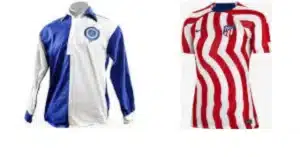
To celebrate its 120th birthday, Atletico first wore a modern version of the club’s shirt in April 2023 against Real Mallorca. It is a half-blue and half-white round neck with a white collar and cuffs. It also bears their first badge, which was proudly worn from 1903 to 1911. The ID card is also pushed into the back collar and has 120 numbers printed in red. Originally, members could only purchase from the club store within 24 hours. However, much to many of the fans’ delight, it has now been brought back to act as the club’s 2023/24 away jersey.
1998 – 2001 – Reebok
American brand Reebok played for Atletico Madrid for three seasons and despite reaching the Copa del Rey final that season, the club was unfortunately relegated to Serie B..In his year of exile, the ten-time Copa del Rey winner had two stylish polo-collar suits, with Reebok choosing to emblazon the stripes with the word “Reebok” instead of their logo. The home jersey is traditional, while the away jersey is navy blue with red side panels and a red collar. White details abound as well.
Reebok gifted the club a really smart centre badge away strip which was worn in both 1998/99 and 1999/00. It is navy blue with a white and red polo collar and cuffs. Red also flowed down her shoulders. Its main feature is the red and white stripes running vertically down the right side of the shirt. The white part is slightly larger than the red part. In addition, the back also features a row of Reebok and Atletico Madrid printed logos.
One of our all-time favorite Atletico home strips came in 1998/99. Reebok has launched a very stylish jersey that you should consider if you are in the market for a stylish jersey for your Spanish club. It features the club’s traditional colored stripes, with the Reebok logo printed inside the black stripes and on the sides of the black umbrella. Additionally, he has a large blue Reebok logo on his right arm, but it doesn’t look out of place as the jersey collar is also blue, as are the sponsor logos below.
1983 – 1998 – Puma
Germany-based Puma has been Atletico’s kit supplier for 15 years, with reports that the parties almost agreed to a restructuring in 2019. Some classic shirts were produced within this period, but there is only one place to start – 1995/96. This particular season is considered to be the greatest in Atletico Madrid’s history, as we mentioned in the previous article, it was the season in which they won the league and cup double.
Its basic equipment for the aforementioned events adds prestige. It has a red polo collar with blue elements and red and white vertical stripes at the bottom. The sleeves are red with a white patch on the bottom with blue and red highlights. The jersey features Atletico Madrid’s crest and the honors they have won so far. classic
The Vicente Calderón Stadium, Atletico’s former home, opened in 1966, so to celebrate its 30th birthday in both 1995/96 and 1996/97, the club had a blueaway strip with their stadium imprinted into the background. The jersey has a red stripe running from the left side to the right cuff, with eight white stripes inside the red stripe.
To pay further recognition to the milestone, in 1996/97 the home top also had the stadium within its background, as well as ‘Club Atletico de Madrid’ within the red stripes. A thin blue vertical stripe between the red and white was also added. Interestingly, he removed the stadium plaid and away shirts from his home on Champions League night.
Moving back to the fondly remembered 1995/96 season, Atletico beat Barcelona 1-0 in Zaragoza thanks to a Milinko Pantić goal wearing a specially designed final strip. It differs from the usual Atlético jersey in that it usually has thin white stripes inside the dominant red jersey. A large club emblem was also imprinted into the background and, like within the 1996/97 home top, thin blue stripes also featured.
From 1996 to 1998, Atlético launched their first home kit, which was blue and white with half stripes. However, the polo collar has no buttons and is instead trimmed with a red stripe, how retro is that?
These articles don’t usually focus on goalkeeper jerseys, but you have to take a look at the 1997/98 edition. It is blue and yellow with a semi-circle and stars and players’ names and numbers plastered on the front. Yes, it looks as random as it sounds.
1980 – 1983 – Meyba
Miba is a Spanish brand based in Barcelona. The manufacturer focuses mainly on Spanish clubs but has made five trips abroad.
The most interesting shirt they produced was the 1982/83 home top which had red dashes running down its sleeves. The V-neck polo collar is also very attractive, half red and half white.
1950 – 1980 – Deportes Cóndor
Deportes Cóndor still has a shop in Madrid and spent thirty years making products for Atletico. There were no crazy designs and the strips were typical of their era, but the pair won five La Liga titles together, as well as five Copa del Reys, an Eva Duarte Cup, and an Intercontinental Cup.
Atletico Madrid Shirt Sponsor History
There are some interesting tidbits in Atletico Madrid’s shirt sponsorship history, so let’s take a closer look…
2023 – present – Riyadh Air
Riyadh Air will become a Saudi airline, and I use the word “will” deliberately because it is not scheduled to begin operations before 2025. It is owned by the Saudi Public Investment Fund and is the first sponsorship deal for the airline since its establishment in March 2023.
Their feature on the strip thankfully isn’t an eye and it involves Riyadh Air in white text on a curved blue background. It also features the airline’s logo with an R above it.
2022 – 2023 – WhaleFin
Before Riyadh Air, Atletico had a controversial deal with Whalefin. The contract was originally expected to last until 2027, but the cryptocurrency company terminated the contract early due to the collapse of the cryptocurrency market.
Yes, their sponsor field includes a wheel, but underneath it also has the URL of their website. From a pure design perspective, it doesn’t look too bad, but there’s an argument to be made that it wouldn’t be a good move for the club to enter this particular industry.
2015 – 2022 – Plus 500
While some may consider it a controversial move for a football club to enter the online market, Atletico are no strangers to it as they have a long-standing partnership with Plus 500.
Rossolino Armenta, Atlético’s head of global partnerships, announced the deal had gone ahead and described the deal as one of “the most successful football sponsorship contracts in Europe”.
Plus500 has different versions of its branding on Atletico Madrid shirts. From 2015 to 2017, the Plus 500 had the words “+ Online Trading” in small print above it. Unfortunately, in the basic set, they are pasted on a white background, but not in the third and third sets – they look much better without the white background.
In 2017, getting a “deal” stamped around the Plus 500 became a bit of a pain in the ass. Thankfully this only lasted until 2019.
From 2019 to 2021, “Online Business” is again placed in small text, but this time it’s below 500 points, and unfortunately it still has the same white background on HomeKit.
For their final year together, 2021/22, the branding was smashed. There is no white background, just “Plus 500” with a “+” sign.
2013 – 2015 – Azerbaijan
Azerbaijan took to sport in an attempt to raise their profile and struck a deal with Atletico which initially cost them just €12m, ending the football club’s two-year sponsor-less spell. According to The Guardian, this includes shirt sponsorship features and Atletico players and coaching staff will also be able to train young Azerbaijani footballers in Madrid and Baku.
It is part of the country’s wider plans as it also hosted Eurovision in 2012 and the inaugural European Games in 2015. They also launched a bid to host the Olympic Games, which has not yet been successful.
Speaking of Baku 2015, its logo also replaced Azerbaijan’s usual sponsorship feature for several La Liga fixtures, including the Madrid Derby, and for Champions League games in 2014/15. This was an attempt to gain maximum exposure for the event.
Their usual sponsor is “Azerbaijan” and the country’s motto is “Terra del Fuego”. The nation’s colors were also included in a small feature alongside it. I think it looks good despite the blue background because it’s pretty and looks like part of the design.
2006 – 2011 – KIA
Dating back to 1944, Kia Motors is South Korea’s oldest automaker. The company sponsors a lot of football clubs, but I think it’s fair to say that Atletico Madrid is the most popular.
It simply features the word ‘KIA’ in red text, set within a red and white oval. In keeping with the club’s colors, it matches their tee box.
2003 – 2005 – Columbia Pictures
This deal has to be considered one of the craziest partnerships in world football. Maybe even within the world of sport.
As mentioned earlier in this article, Columbia Pictures used this agreement to promote the film by wearing Atlético jerseys when it was released or premiered. In 2003/04, the club had SIXTEEN different logos taking that center spot.
However, the deal never went through and several famous actors including Will Smith, Harrison Ford, Halle Berry, Tobey Maguire, and Kirsten Dunst wore Atletico Madrid jerseys in return.
Would you like to see something like this happen again?
2000 – 2003 – Idea Electrodoméstico
Idea Electrodoméstico is a Spanish brand that sells home appliances. Its distinguishing features include its logo which is simply “Idea” with the letter “I” on a red background and the rest of the word on a blue background. It wasn’t a complete eyesore but, design-wise, there have been better sponsors.
1997 – 2000 – Marbella
The city of Marbella appears on the jerseys of Atlético Madrid as well as several other Spanish clubs, including Real Valladolid, Sevilla, and Real Betis. However, Atletico were the first club to join due to internal connections. Jesús Gil served as president of the club from 1987 to 2001 and mayor of Marbella from 1991 to 2002. Gill was not a particularly popular figure within the football club as he closed the academy in 1992 and had a strained relationship with fans, journalists, players, and managers. His decision to close the academy led to Raul joining Real Madrid and as the old saying goes, the rest is history!
Marbella’s patronage is marked only by the word “Marbella” in specific, clear text. You just can’t go wrong with that.
1996 – 1997 – Bandai
Bandai is a Japanese toy manufacturer based in Tokyo. Their shirts feature a simple “Bandai” and an unusual letter A. I think it goes well with all the shirts.
There is evidence that the brand uses Atletico jerseys to promote one of its products – the Tamagotchi. The text font they used for this is cool.
1990 – 1993 and 1994 – 1996 – Marbella
After playing for Marbella from 1997 to 2000, Atletico also had Manchester City on their shirts for two other spells in their history. Unfortunately, I’m not sure the branding looks as good as it did on the “sticky” white background at some point in years past.
1993 – 1994 – Antena 3 Television
Ahead of his second spell in Marbella, Atletico formed a partnership with Spanish terrestrial television channel Antena 3. However, regardless, I see that their logo is not ugly.
1987 – 1990 – Mita
The club’s first shirt sponsorship partner, Meta, was a photocopier manufacturer acquired by Kyocera. The latter is a multinational ceramics and electronics manufacturing company headquartered in Kyoto, Japan.
Previously, Atletico’s jerseys from 1987 to 1990 featured the word “Meta” in small blue letters on a white background. The text font has earned this one a few extra points – it wasn’t too bad.
Conclusion
Atletico Madrid is very fortunate to have a long-standing shirt manufacturer that can consistently meet their needs. They have a 30-year relationship with Deportes Cóndor, a 15-year relationship with Puma, and their current relationship with Nike may last 25 years. They were also very lucky because there weren’t too many bad t-shirt designs during that time.


